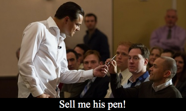
The age-old sales adage, “sell benefits not features” is as true today as ever it was. Selling a complex product by the features is a minefield; just ask the Marketing departments at HTC or Sony trying to do battle with Samsung for Android market share. Tech products have so many features that can be described in so many ways that only real enthusiasts ever develop a sufficiently good understanding to cut through the marketing babble and understand the specs.
In this regard, Apple can as usual be highlighted as real masters of the art. They understand that what most people want from a purchase is to know how it will benefit them. They convey those benefits in simple meaningful product descriptions and advertisements. Geeks may complain that it is difficult to benchmark an iPhone’s specifications against its Android competitors but Joe Public doesn’t care about that – he knows that his phone is going to deliver what he needs/wants from it, and that really is enough.
We do the same thing in consultative sales. We help our clients to see the benefits of the services we offer. We establish the value of those benefits and then make the sale. However sometimes, we can get so proud of our product, service that we will try and lead with features.
This is a mistake! Why so?
100% of your customers can understand the benefits of your product or service. Example – “We help people achieve a more financially secure retirement.” That statement is clear and compelling. Contrast that with this statement – “All of our consultants are ABC Credibility rated and have global experience.” Maybe 15-20% of your customers will know exactly how using an ABC Credibility rated consultant has benefits for them. However many will feel inadequate due to their inability to assess the benefit of what they have read. They may feel that your company is not a good fit for them because they don’t have the experience to buy with confidence.
These same sales lessons are played out on websites too. I have often heard of a website being likened to your online store. That may be true in a commodity sales situation. But in services and B2B your website is a virtual sales person. With that in mind, how should you use your website to communicate with your audience?
Homepage
Too many service and B2B companies have what I call a “tombstone” homepage. The homepage basically says, this is our name, this is what we do and this is where we do it. I call it a “tombstone” because, that’s what you write on tombstone and, it will kill your sales!
Your homepage should rather be a high impact space for you to make your top 1, 2 or 3 strongest arguments for choosing you over the competition.
For example, when a sales person meets someone at a networking event they do NOT say, “Hi, I am Fred and I make websites in Bristol.” That would be a waste of a good opportunity. What he DOES say is, “I work with companies like yours to help you implement digital technology more effectively.” See what he did there? It is no longer about him; he made it about them and focussed on their needs.
What your homepage should say – “We are ABC Couplings. We keep the Eurofighter in the air and make your car safer. Here is what we can do for you.”
The recent trend for web design, following the fashion for large images and continuous scrolling designs really plays into this type of selling. Scrolling through benefits helps reinforce your message in the mind of the prospect and recent studies indicate that not forcing a visitor to decide which page to visit plays into our instinctive inertia, to keep doing what we are doing. This should improve dwell times and reduce your bounce rate. A clear and compelling call to action at the end is usually your “how can I help you” opportunity.
I won’t say that information on features is not useful. But when you discuss features, consider explaining how they deliver a benefit, and you’ll start aligning with your customer’s needs.
