Construction Consultancy WordPress Enterprise Intranet

Overview
One of our longstanding clients in the construction consultancy sector reached out to us with a request to revamp their intranet platform. Their goal was to enhance connectivity within the global team and facilitate more effective communication of company-wide announcements, news, and events.

Laying The Foundations
We initiated the process of the rebuild by organising workshops that provided a platform for input from all departments and perspectives within the business.
This allowed us to establish a roadmap that not only included essential features for maintaining parity with the old system, but also incorporated customised functionalities inspired by the insights gleaned from each respective team.
Next, we conducted a thorough audit of the current platform to assess the existing content types, streamlining each page into its dedicated template, complete with its unique components.
These components formed the basis of a design system used not only in the initial design phase but also in subsequent iterations of the intranet.

Better Connected
In tandem with creating the design system, we continued to iterate and refine numerous concepts that emerged during the discovery phase of the project.
Some of these enhancements were highly tailored to specific departments, while others focused on fostering more efficient team connectivity across the board:
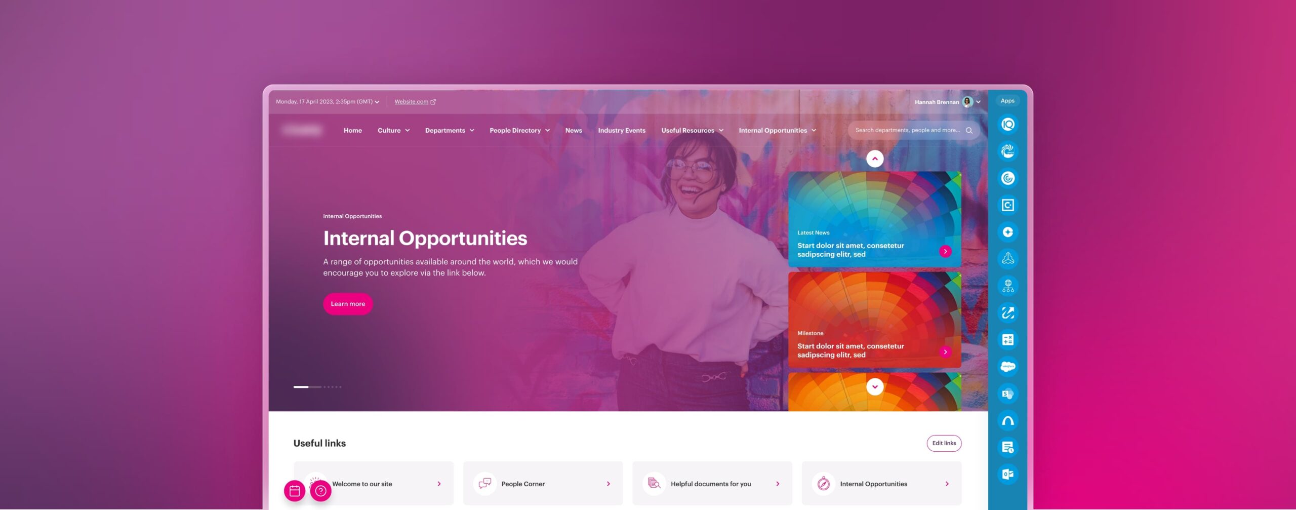
The “Useful Links” feature enables users to bookmark a particular page as a link, which then resides on their homescreen for easy access to materials they wish to revisit.
Ensuring the orientation emerged as a crucial aspect of the user experience. We incorporated functionalities for users to track when their colleagues are active, and even integrated a Helpdesk for any queries they may have.

Connecting users to their daily drivers was also high on our agenda.
We designed a persistent sidebar panel that ensures users’ everyday apps are just a tap away, providing seamless accessibility throughout their experience.
The updated people finder now offers more personalised and detailed information about each colleague, enhancing clarity when trying to locate the right person.
We carried this idea of the best in class search to every search user journey throughout the platform, including how users find documents and posts.

Better Informed
Designing versatile article templates was crucial to ensure that all types of content could be effectively presented on the platform. This involved careful consideration of various elements such as layout, typography, multimedia integration, and interactive features.
The templates were crafted to be adaptable and scalable, allowing for easy incorporation of different content formats, including text, images, videos, infographics, and more.
During our discovery sessions, another significant insight was the strong desire of teams within each department to engage more with company content. To address this, we aimed to empower employees by enabling features like commenting on articles, mentioning other colleagues, and providing the option to react to content. This fosters a more interactive and collaborative environment within the organisation.
More projects
View AllWebsite Design and Build
Fazeley Studios
Placing Talent In The Limelight
Vogue Business Talent
CMS Driven iPad App
Leica Microsystems
Imagining Naughtiness
Ann Summers