Aesthetic – Usability Effect
There is an adage from the pioneering age of jet aviation which is attributed to Bill Lear, the creator of the Lear Jet. “If it looks good it will fly good.” As it turns out, in this is something of a truism. Throughout the history of flight, aircraft designs that were more graceful and sleek tended to be the designs that were also the best to fly and the most optimal performers. These beautiful designs are balanced by numerous pioneering and adventurous designs that had awkward aesthetics and usually wicked handling.
This truism seems to pervade more than just the world of aviation. Every day we trust our aesthetic instincts when making judgements about all sorts of things from choosing a sandwich to assessing a person’s character. Most often, we get these judgements right: well presented food (usually lovingly prepared) is likely to taste good. Likewise the way a person looks may infer life choices that could reflect on someone’s character. While this practice is not scientific and can lead to some poor judgement calls, it is human nature.
When designing websites and apps for our target audience, we should take this into account, the quality of the design will cause an emotional response. This response will usually be linked to how easy the site or app is to use, or what our perception of its quality is.
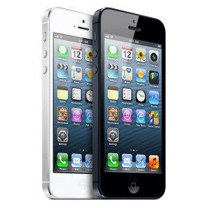
The enormous success of the Apple “i” products has been largely design driven. They are rarely the most powerful or most capable devices on the market, but their design is so consistently well thought out that they become very easy to use. In this case the two elements – form and function merge into a product that is both beautiful to behold and a pleasure to use.
Beautiful designs also work well in practice because of the effort that has been put into all elements of the design.
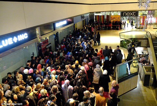
Correspondingly, when you think of a website or app that you found really challenging to get to grips with, there is every likeliness it was ugly too. I can think of a few examples right now but this isn’t a name and shame type of article. Another illustration that comes to mind is a jumble sale, the kind you find on the 26th of December. When you visit a shop that has all of its merchandise clearly and beautifully laid out, the perception is that it is very easy to find what you want and it looks more attractive to you. If you arrive at 9:30 on the day of a sale, all of the order and coordination that went into setting the shop up for the sale has been undone by a tidal wave of shoppers. The resulting mess is visually confusing, emotionally draining and leads to irritability among shoppers and a general feeling of discomfort.
Takeaways:
- People are more forgiving and patient of beautiful things
- Beautiful design is part of a process that is linked to good experience
- Order, balance and intuition are the fundamentals of both beautiful and practical design
- Poor experience can undermine the perceived quality of an item
- Unattractive design will struggle to engage users despite the quality of the content and functionality
Can you think of any examples of products, websites or apps where they do an especially good or bad job of this? I welcome your thoughts, opinions and examples in the comments box below. If you think your website needs a design upgrade, contact our web design team today.


