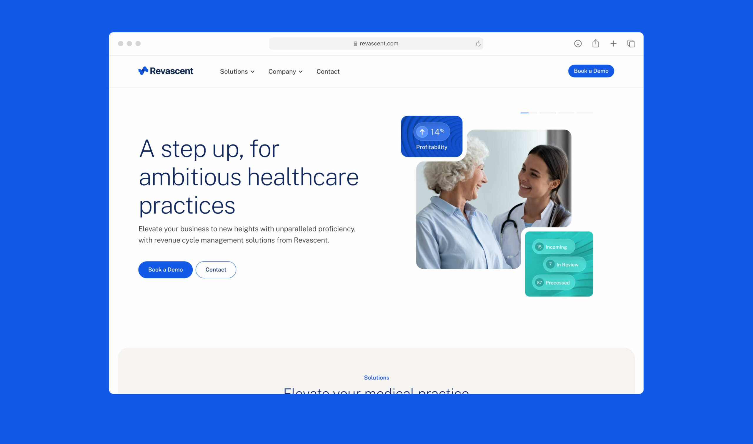
HealthTech Provider Ascending Together

This HealthTech Provider was formed from the merger of two prominent practice management software firms, in the private medical service sector.
Our mission was to envision this fresh start, crafting a new brand identity and designing a website to usher in this exciting new phase for the company.
The collaboration with our client centred on building trust between users and its platform. Working hand in hand, we constructed a comprehensive brand that radiates assurance and professional credence, empowering the medical number crunchers to run their practice effectively and in turn ensure their patients get the best experience possible.
Branding
In the initial stages of the project exploration we identified the necessity for this brand to pursue two divergent pathways. Beyond instilling trust, it was imperative that the brand narrated a tale of progress, triumph, and accomplishment.
We initiated an exploration into symbols within the realms of biology and the medical field. This guided us in crafting diverse iterations of symbols embodying themes of life, growth, and ascension.
In the final version of the brand logo, we seamlessly blended these themes, creating a symbol that not only contains characteristics synonymous with the industry (like alluding to a double helix, or a cardiogram reading), but also conveying an upward trajectory. This is complemented by a clean sans-serif typeface that not only accentuates the symbol but also provides a sense of structure to the logo overall.


Finally, we made a strategic choice to shift the brand’s focus from mere statistics to spotlighting the individuals who dedicate themselves to the medical field every day

Website Design
We identified our key objectives for the HealthTech Application’s web presence, aiming to cater to potential customers, existing clients, prospective employees, and internal stakeholders alike. The website design seamlessly embodies the refreshed brand identity, permitting the business to climb greater heights in the future.


More projects
View AllReimagining Greatness
Custard Factory
Conversion Focused Marketing
Ascendx Website
A Simpler Way of Compliance
PeopleClear