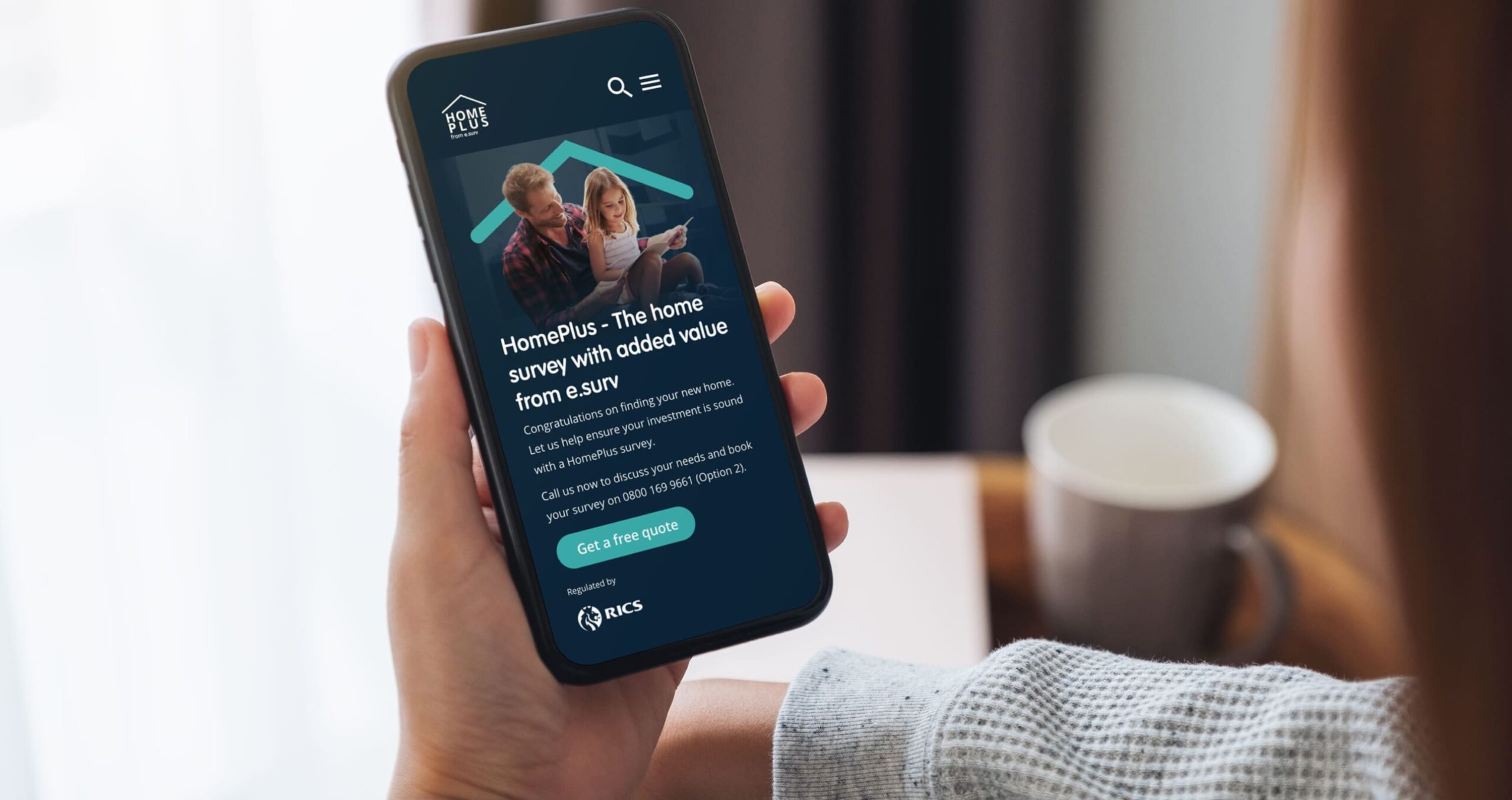
Residential Property Surveyor A New Home

Buying a house isn’t just a transaction—it’s a pivotal life event filled with hopes, dreams, and invariably, a multitude of questions. For many, it’s a journey with so many twists and turns that finding the right guide can feel overwhelming. Amidst this vast landscape, how do we distinguish trustworthy advice from the noise?
That’s where this residential property surveyor sought to make a difference. When they partnered with us, they envisioned themselves as more than just a service; they saw it as a beacon, guiding prospective homebuyers through the intricate maze of property acquisition. Their aspiration was to craft an immersive digital experience that simplifies the complex, providing clarity amidst the confusion.

Today, this residential property surveryor stands as a testament to that vision. It’s not merely a platform; it’s a comprehensive digital companion for homebuyers. It offers a wide variety of resources, ranging from property surveying insights to answers for those ever-persistent home buying questions, as well as deep dives into the nuances of the property market—all accessible with a simple touch.
But their ambition didn’t stop at content. They recognised that to truly resonate with users, the platform needed to be intuitive, engaging, and above all, user-centric. Leveraging our extensive experience in designing websites that prioritise user experience, we embarked on this collaborative endeavour. Our shared mission was to transform their website into a space where users felt understood, empowered, and confidently guided by this residential property surveyor – every step of the way.
The opportunity
Building on the vision set out by the client, the opportunity before us with this project was clear. Our objective was threefold:
- firstly, to design a bespoke surveyor solution tailored for homebuyers;
- secondly, to create a consumer portal that not only educates but also offers trustworthy information; and
- thirdly, to present a digital report format that users could access with ease.
A critical insight shared with us was the importance of demystifying the process and promoting the merits of investing in an independent residential survey. With the right conceptual framework in place, we were confident in spotlighting these features effectively. Eagerly, we set forth on this collaborative journey.

Our approach
Transitioning from the broad objectives, we honed in on a strategic roadmap for this project. We proposed segmenting the project into two distinct phases: initially, spotlighting their tailored surveyor solution, followed by the development of an information hub—designed to reinforce their premium service offering.
In close partnership with their team, we set about sculpting a design ethos centred around the user. This meant creating an environment where every stakeholder, from fledgling homeowners to seasoned property surveyors, felt a genuine connection.
Our exploration phase took us on a journey across various digital landscapes, dissecting websites both within and outside the surveyor realm. This exploration informed the essence of this residential property surveyor’s digital experience. From these insights, we crafted a series of low-fidelity prototypes, allowing us to iterate and fine-tune our concepts.
Central to our approach was the infusion of warmth and humanity into the user experience. Given the weighty nature of the subject matter, it was crucial that the website struck a harmonious balance—professional, yet exuding a welcoming warmth.
Paving the Way for Future Growth
The architectural blueprint we crafted for them wasn’t just about the present—it was designed with an eye on the horizon. Upon the completion of primary phases of the project – we continued to support our client in further expanding their experience; building upon the foundations we have built and the relationship we have formed with our client.
But a professional website’s design goes beyond mere aesthetics or functionality. It should be an inviting gateway to the brand’s premium offerings—a digital handshake that fosters trust and initiates meaningful connections. This project has proven how expertise, and user-centricity can converge and offer a genuine experience.
More projects
View AllImagining Growth
Claire’s
CMS Driven iPad App
Leica Microsystems
A Sight To See
Wealth Management Adviser
Digital Publication
Reinventing Newsworthy