Two guys sell pretty much everything they own in their quest for inner peace, now they urge us to do the same. Should we follow?
First off. Hello, I’m Jack ?. The Digital Creative Director at fastfwd. My expertise is in User Interface & User Experience design to craft creative, effective digital products. With this being my first contribution to the blog, it felt appropriate to explore the design landscape and bring something new to the table to discuss.
You see, the thing about design is – it often changes. It’s inherent. ‘Trends’ and methodologies relentlessly contest each other year on year, and it is up to us, as designers, to evaluate whether we should or should not adopt any of these new discoveri
Fastfwdes into our set of design principles.
I’m a believer that good design is often reflective of the necessities of the audience at large, and as such should be influenced by external discussion to complement the more esoteric thoughts within the design community. One such topical discussion is Minimalism, a rising topic over the last year or so despite being around for some time.

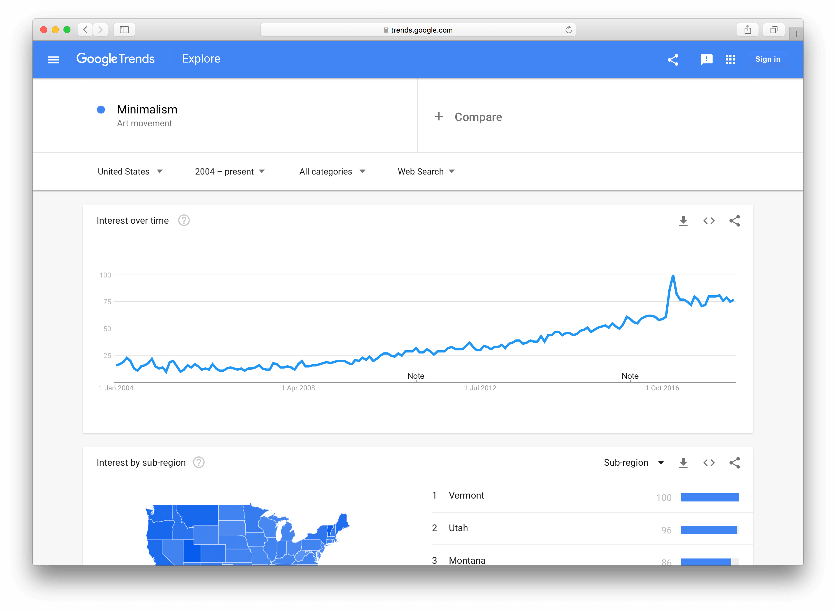
So we have to ask – why is a movement that began in the 1950s gaining so much traction in 2018, and what can we take away from it?
Why now?
With technology becoming more and more seamlessly integrated into our daily lives we are finding ourselves able to accomplish more than ever before. The history of information is within a few key presses away at any moment. We’re more productive than we’ve ever been, yet we still find ourselves agonising over how we spend our time; in perpetual fear of whether we are missing out on the good times by committing to something else, creating mental wishlists for our never satiated appetite for material objects, or feeling bad for spending time browsing the dankest of memes. Within all this noise, we find ourselves in choice paralysis, unable to discern what means most to us – what is important.
Enter Joshua Fields Millburn & Ryan Nicodemus, who, as luck would have it, claim to have the answer to your sudden onset of an existential crisis.
 Joshua Fields Millburn (left) & Ryan Nicodemus (Right)
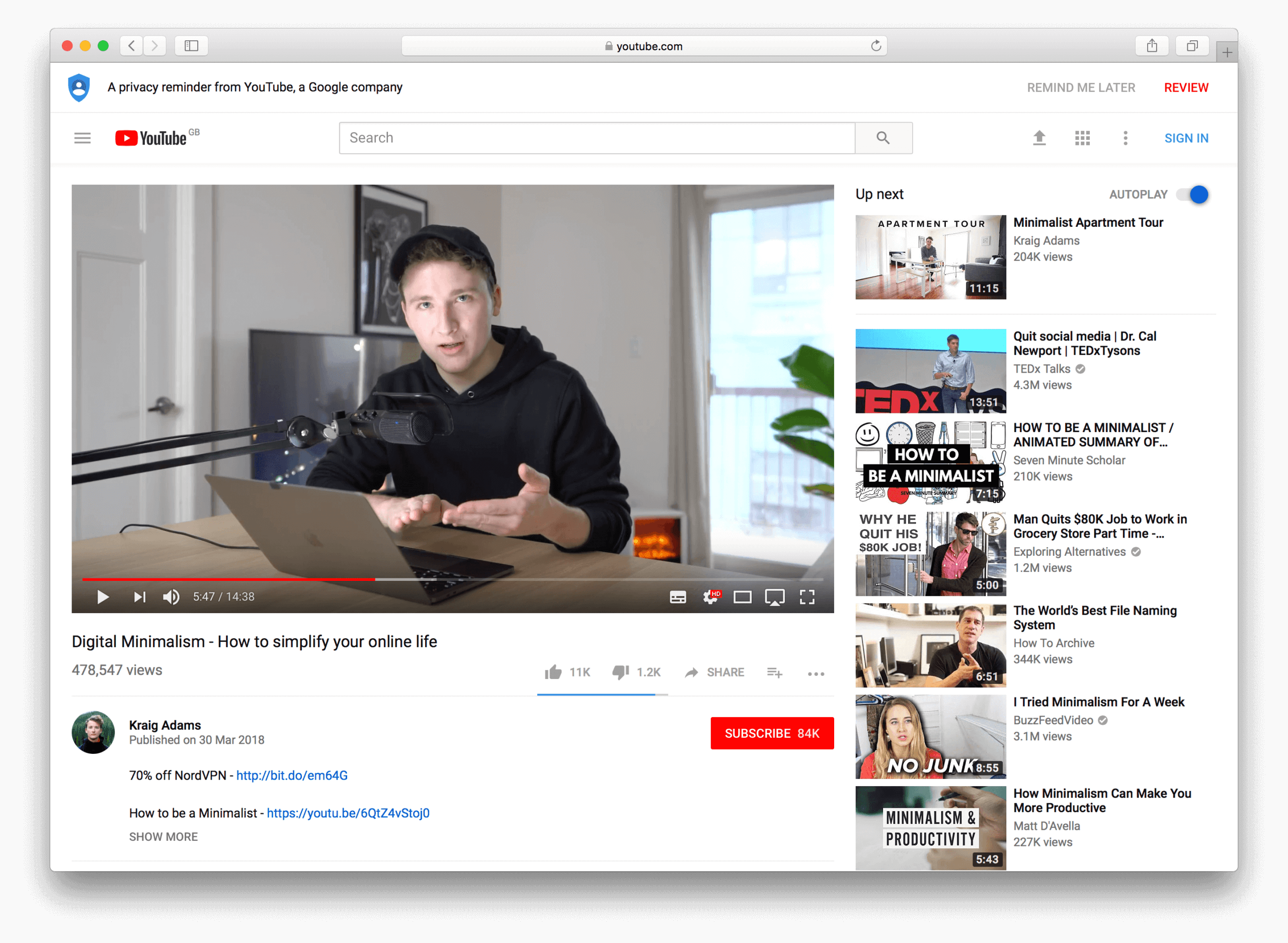
The new age founders of the Minimalist movement have seen a huge surge of interest recently. Reborn as a ‘lifestyle’, their somewhat sensationalist Netflix documentary encourages us to live with less to gain more. The documentary follows Millburn & Nicodemus through their campaign around the country, interjected with personal pieces, including a sad story from Millburn regarding his awaking after getting a divorce from his wife. It’s difficult to conclude whether the intentions of these guys are as pure as they make out to be, the sceptic in me thinks maybe not, but you can’t deny they have impacted on a global scale and made people question their own consumerist habits. The movement has transcended into the mainstream media, with Millburn & Nicodemus’s names becoming more synonymous with the term ‘minimalism’ than Donald Judd, Carl Andre or Sol LeWitt. YouTube is now littered with videos showcasing minimal living, advocating digital downsizing alongside an ever-growing community. It’s truly fascinating how the movement has been reappropriated for 2018.

YouTuber Kraig Adams in his video “Digital Minimalism – How to simplify your online life”
How is it applicable to your project?
“Good design is as little design as possible” – Dieter Rams
Sudden popularity aside, Minimalism and it’s principles have always been relevant within design, so it’s no surprise it’s applicable to digital. The last decade has seen a shift in how we, as users, spend our time. Today we are oversaturated with websites, videos, games etc to entertain us at a moments notice, so, on the whole, we value smaller units of time. As I mentioned earlier we, as designers have become more user centred, catering to users needs first and foremost. In short, digital offerings need to go above and beyond what is expected from the user. So with that being said, I’ve compiled a few points below inspired by Minimalism which can help improve your service:-
Begin with questions rather than answers
This should apply to all projects regardless of whether you are working in a minimalist fashion. However, it’s important to note that starting with a select handful of questions, we can begin to get to the heart of the issue by setting design parameters. Be sure to ask questions like:
- Who are we making this for?
- What problem do they have?
- How does what we are creating solve the user’s problem?
- Does it fit into the user’s journey?
From here we can reverse engineer the solution, keeping what we’ve learned about our audience and business goals in mind.
Make your content the noise
This is all about valuing your voice. It’s often the case that many websites overcompensate on an aesthetic which leads to an overall detrimental reading experience. For the most part, we are communicating information or ideas to an audience. Give your message space to breathe. White space is your friend.
Also, it’s important to remember to be clear and concise with the tone of your message to ensure a frictionless user experience to visitors. Be explicit with your copy rather than ambiguous when it comes to describing a function – especially with regards to call to actions.
Minimal design is optimal design
Following on from the previous point, stripping back elements from your design can lead to a more performant product. Subtractive design is the process of iterating on a design, retaining only the essential parts whilst removing the less valuable components. Early Google benefitted immensely from this approach. Whilst most search engines offered a more feature rich experience, with widgets such as news and weather on their search pages, Google’s homepage was (and still is) designed for the sole purpose of using the search field.
We find working in this manner leads to an overall more intuitive experience to the user, limiting the chances of choice paralysis.
Iterate, iterate, iterate
Of course, this doesn’t just happen straight away. Creating a mixture of simple and sophisticated design is hard work, and takes time.
Just recently the team worked through a question of whether to include a mute button into a conferencing application, or whether a better solution would be to nest this function into the volume slider – would the user intuitively know how to use this piece of UI at face value in the context of an important meeting? This is a scenario we encounter every day which can be solved in a variety of different ways, but what’s important is achieving the right solution – discussing meticulously and often is the only way to ensure this sustained level of quality output.
At fastfwd we subscribe to working through design sprints, asking the aforementioned questions to help us improve the design with each iterative cycle.
Summary
In closing – be sure to involve in a wider discussion when it comes to your creative problem solving, tangential thinking is a great skill which can be developed by being more mindful of your surroundings and studying the relationships between its parts. Strong conceptual principles can withstand the test of time and can be applied to any future medium, shaping themselves to new challenges. Minimalism isn’t a bad place to start.
If you’ve enjoyed this post and want to get more out of Minimalism, why not take a look at our MVP page. For all other enquiries, contact us here.