Last week I had the pleasure of joining the Institute of Internal Communications (IoIC) for their Annual seminar. As a guest speaker, I discussed the ways that social media websites have changed the way we engage with software and indeed changed the way it is designed. I thought I would publish my notes here, they are bullets that will be quick to breeze through if you were at the event.
Matthew Jensen from Just90.tv on Vimeo.
The social media problem – Slide 1

- Everyone talks about social media using terms like challenge and policy.
- Social media is as much of a challenge to communications as movable type was.
- That is to say that those who wanted to control what was being said, saw it as all risk. However many saw it as a force for good, enabling people to freely communicate and share ideas.
- So this was bad news for the Bourbons, who lost their heads over it, come to think of it, social media had the same effect on Gadhafi.
- Those who seek to control communication, will always be overthrown
- Communication is the driving force behind democracy and enlightenment
What affect has this had on software development?
- In the past, people learned how to use software tools. It was designed to be used in a way that the engineer thought was most efficient or logical.
- This is still largely the case in enterprise software. Tied into legacy platforms and obsolete technology.
- Now though, the outlook is different, we talk about things like customer journey, User experience and intuitive design
- This is where social media and to a great extent mobile devices have lead the way in changing how we think about software design.
So what can we learn from the huge social and popular success of Facebook, Twitter and Pinterest and how can we use it to our advantage in an internal communication environment?
The State of the Social Art – Slide 2

- Facebook is the established market leader in social media. Not without its flaws and detractors, its popularity however is beyond question.
- What new ideas has Facebook introduced?
Chronology
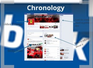
In Facebook, posts are fed in more or less chronological order. We may not be aware of this, because it made so much sense at the time but traditionally this has not been the case. The advantages to using chronology are obvious but no other software has ever made chronology so literal and easy to navigate. It’s so easy to scroll from day to month to year.
Social
It’s all about people. We are hard coded to respond to faces. Just by butting the face of someone you know and trust next to a post, dramatically modifies your disposition towards it.
It also plays to our desire for inclusion; we don’t want to miss out on anything our peers are engaged in.
This is the driving force behind the success of social media. This is the main thing we want to harness going forward.

Prioritising and Tagging
At some point in 2009, Facebook moved away from a purely chronological layout and started deciding what content was more important and bringing that to the top of the feed.
Page managers are able to stick the posts that they most want you to see at the top of a feed, protecting it from being pushed down by more recent activity.
Tagging content with subject tags also enables people to search by type and have posts with those tags brought to the top of a feed.
Visual Mapping
You may have heard of the Google Golden Triangle. That is a triangle at the top left of a website where humans naturally focus their gaze. Facebook did similar eye mapping research when designing the new profiles. This means that the important content is in direct line of sight.
Powerful Visuals
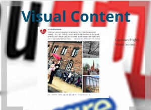
Pictures and colour draw in the eye, seasoned social media users will post an image along with a status, to get the best response. Beautiful topical images are a great way to engage your audience, even more powerful than “killer headlines”

Mobile Engagement
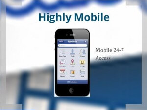
The social audience is highly mobile, specifically the younger users. Right from the outset, social sites were optimised for mobile with early 3G phones having access to Twitter and Facebook. Phones are about communicating, social media is communication and they are a natural fit.
Infographics
Infographics are not all that new, maps are a form of infographics and the notion of representing data visually has always been appealing. It is now though with social media that these infographics have become so sharable, they have become popular ways of visual storytelling, with greater impact than old school graphs and tables.
The Solution – Slide 11
Nigel of CW was approached by a client with the challenge of proposing a digital solution to their communications challenge.
20, 000 staff
400 locations
Highly mobile
Young
Multilingual
Design
(Client details redacted for confidentiality – sorry – those at the event had a special treat. )
With a company like this you have a corporate identity that is fairly proscriptive about how new products will look. Working within those limits however we were able to design a solution that was modern and engaging, incorporating rich dynamic media content.
We incorporated the lessons learned from popular social websites, principally Facebook and Pinterest.
As you can see in this view, we have used the chronological view for presenting content. The most recent communications being the most relevant.
However to ensure that very important announcements are recognised, content managers and use a sticky post function to keep certain messages in the golden triangle.
Inspired by Pinterest, visually powerful images, leading the written content. Humanising the content with sharing and comment functionality.
In the next slide we can see how being able to visualise data can be so powerful. Originally, this function was to be a horizontal ticker, like a news ticker. That wouldn’t have sat well with this design; instead we opted to visually represent all the activity on a UK map, giving a far more relatable easy to digest experience of the data.
Now our audience are used to creating content on the fly, they don’t log into a CMS before posting. We gave them the ability to create posts and comments from the interface just as they would in Facebook or Twitter.
Responsive design is the big technology of 2012-13. It enables a website to be truly platform independent, working just as well on a desk top as a tablet as a mobile phone. We see lots of big brands incorporating this technology on their websites. Having this mobile access, means that people can engage with content on the move, or enjoying some down time, and not stuck at a work station. Mobile is the principal way many young people use the web today.

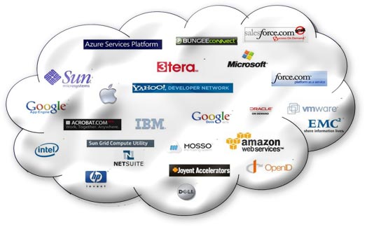
So this web software or cloud based as we like to call it. This has a big advantage from an IT point of view; it relieves pressure on servers and is device independent so it will never become a legacy headache for new computing systems. Some IT managers are still weary of the cloud, I won’t go into too much detail about that but their fears are largely outweighed by the advantages.
In summary, could-based, social influenced technologies have freed software from the restrictions of IT departments, HR managers, corporate brass and it has democratised it. Now the conversation goes both ways. Open minded managers will know that it is vital to wellbeing of an organisation that all voices are heard, more and more so as generation X and Y become a more integral part of organisations. They think differently, they expect to be spoken to differently and they expect to be listened to. Hopefully, these are the tools of the future that will facilitate this two way conversation.